Data Visualization Project Highlights
Explore projects that explain data through interactive graphs, charts, or dashboards.
Landing Page Dashboards
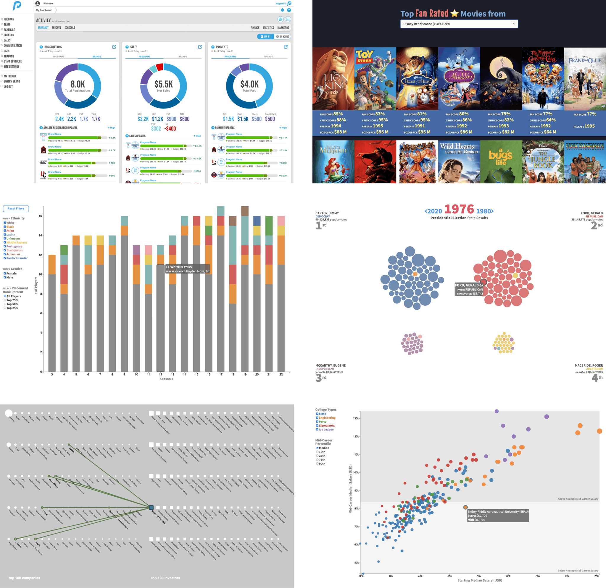
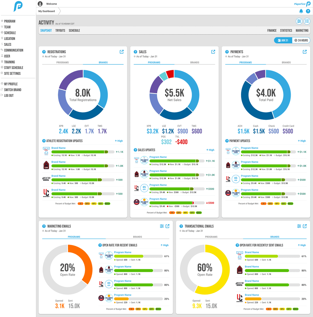
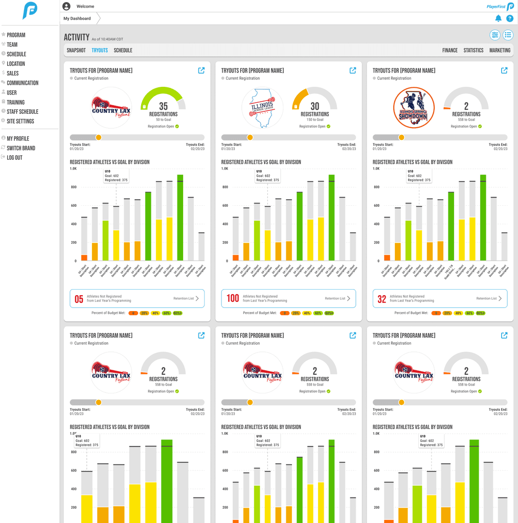
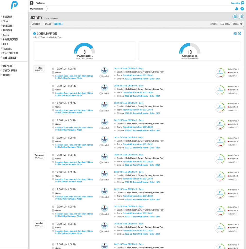
At PlayerFirst, my first assignment was to collaborate with the UX Manager to create a landing page dashboard for the admin-facing side of the athletics management platform.
The dashboard offers a snapshot of the athletic brands and programs to which the logged-in user belongs. Across six tabs, it covers important topics such as registration and finances. Panels aim to provide rollup insights in addition to more granule info about individual brands and programs.
US Presidential Election Returns By State Since 1976
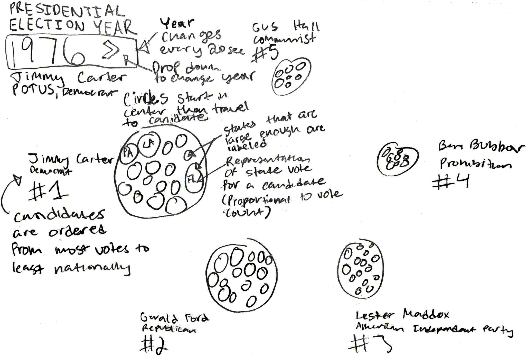
This beeswarm chart illustrates the distribution of the popular vote in U.S. presidential elections from 1976 to 2020. For each election year, the top four candidates, their party affiliations, and their vote totals are displayed.
This d3.js visualization employs a force simulation to group circles, each representing a state party’s total votes for a candidate. The groupings visualize shifts in party popularity over the past five decades.
Preliminary Sketch
The initial UI sketches for this visualization included extraneous labeling and lacked the final design's forward and backward election navigation. The circular layout was also abandoned for a more scannable grid structure that features only the top four parties important in modern elections.
Demographics of Contestant Performance in the Reality Show, Big Brother
This interactive stacked bar chart explores the demographics of how contestants placed across the first 22 seasons of Big Brother, a reality show in which a group of people vote each other out to be the last player standing.
The project uses the d3.js data update pattern to dynamically update the data based on the user’s selected filters, rendering the corresponding visuals accordingly. As the stacked bars change, it is easy to see that minority contestants are consistently voted out earlier than their white male counterparts.
Starting vs Mid-Career Salary By College Type
This scatterplot offers insight into the salary earnings of college graduates based on the type of school they go to: state, "party", engineering, liberal arts, or ivy league.
Filter by college type for a clearer look at where schools of your desired type fall in terms of starting vs mid-career salaries. Toggle between median mid-career earnings and the 10th, 25th, 75th, and 90th percentiles of mid-career salaries.
Disney Cinema Through the Ages
This narrative based visualization explores the key concepts, fan + critic reception, and box office earnings of the seven eras of Disney movies.
Movie data provided by an outside API populates bar graphs that compare each decade's averaged data, as well as an interactive exploration of movie posters sorted by fan rating.
Top 100 Companies and Investors
This chart explores the connections between the world's top 100 companies and top 100 investors.
This project provided the opportunity to investigate p5.js, a visualization library which focuses on drawing shapes based on pixel location in an SVG canvas. Each company and investor is stored as a Javascript class and can be investigated further within a modal.
